Wednesday, July 31, 2013

Everything Old is New Again in.... Art Deco

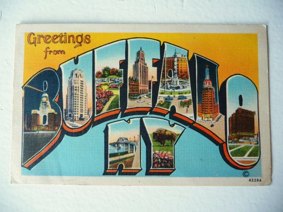
Art Deco happens to be one of my favorite styles.  There are quite a few examples of Art Deco in Buffalo, NY.  Some include: the architecture of Buffalo City Hall, decor at Hotel Lafayette, Buffalo Central Terminal, Electric Tower, etc.


What is Art Deco?
   Art Deco is a decorative style.  It was especially popular during the 1920s and 1930s.  It originated in Europe.  Art Deco is characterized by geometrical shapes, bold outlines, zig zag forms and synthetic materials.


Items from Etsy shops that would fit this style:

TheCreativeHearth
Buffalo, NY Postcard
https://www.etsy.com/listing/153941543/vintage-postcard-art-deco-greetings-from?ref=shop_home_active
Vintage Postcard Art Deco Greetings From Buffalo New York Linen Postcard Win the War stamps 1943 WW II

JamesGreenwaldDesign
Richardson Towers
https://www.etsy.com/listing/153325796/richardson-towers-buffalo-ny-digital?ref=shop_home_feat

Richardson Towers Buffalo, NY Digital Print - 11x14


BeautBits
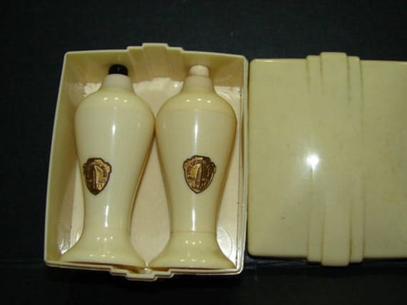
Salt and Pepper Shakers
https://www.etsy.com/listing/103308614/1940s-art-deco-salt-pepper-set-in-box?ref=sr_gallery_1&sref=sr_5fcb1aa5d861392d680fc437becf4b12175799fd1100d6d440e0686043b4e045_1375211003_14320609_deco&ga_search_query=Art+Deco+ny&ga_view_type=gallery&ga_ship_to=US&ga_page=4&ga_search_type=all

1940's ART DECO Salt & Pepper Set in Box Empire State Building NY Unused


Themes in Art Deco:

bold
geometric
luxury
glamour
social progress
technological progress
strong colors

Do you have any pieces in your shop that fit this style? If so, post below.

Tuesday, July 30, 2013

Photo tips 4: Staging your products

You've made a gorgeous piece of craftsmanship, now how do you best represent it to your customers?

Etsy listings have five free photo slots available. The better you can use these slots to your advantage, the more likely you are to have good views and sales.


Five types of photos will cover most of the bases:
  1. Overall image
  2. Detail
  3. Reversed (back of item)
  4. Item in use
  5. Packaging
Variety of angles is very important, as customers are "buying blind" without a chance to see or handle your products in person first. There have been times where I'm shopping and found that a different angle of the sweater or purse makes me want it more. And often times, if I can't get a good idea of the product's size or features, I'll just walk away and find something else.

Another creative way to use your allotted slots is to create a collage. These are pretty easy to do with photo editing software:


Backgrounds

White posterboard: You can buy this very cheaply from Walmart. Tape it to a table pushed up against a wall, so the paper is curved. This will avoid a harsh line in the background. Use the matte side, rather than the shiny side, to avoid glare.

Light box: This is particularly good for jewelry, pottery and other small/medium objects. It gives even lighting from all sides, and you can shoot any time of day. The diffusion of light provided by the veiled sides helps eliminate harsh shadows.

Step-by-step instructions for a DIY light box here!

For larger objects, you'll want to find a large, empty space to take photos. Clothing should be shown on a person or mannequin if possible. Hanging against a white wall on a wood hanger also looks nice. Quilts and blankets can be shown folded against a white background, but staging them on a bed is ideal to show the entire product.

People vs. models

Showing your items against people is a great way to illustrate scale. Take pictures of yourself or rope a friend or relative into modeling. Most digital cameras now come with self-timers so you can set up your own shots.

A note: If you make a product that people wear, like jewelry or clothing, you'll want to indicate if the item shown is the actual item the customer will receive. I make earrings, so I made a few demonstration pairs to wear for photos. Worn earrings ... not very sanitary!

Staging in an environment

Isolated photos are great and all, but what about showing the item in use?


So ... white is a style, right?
A lot of Etsy's success is due to the image and marketing of the Etsy "brand" (though technically it's only a collection of stores, not a store in itself). While there is a vast variety of items on the site, there's a certain look to many of the items on the site.

A popular kind of staging tells a story. Look at catalogs like Pottery Barn and Land's End. They don't just sell a candle or a t-shirt, they sell an image, an aesthetic, a lifestyle, and their photos reflect that. The photos give context.

Let's say you are selling fancy crystal jewelry, and you've decided to market to brides. Stage a necklace on a rich-looking black velvet display piece, or add props like a satin purse in the background. Brides who look at your necklace can more easily imagine themselves wearing it.

So, here's an example of contextual staging (excuse the meh quality of the last two pictures, I did them quickly for this blog):


Photo 1: "A cute wooden bowl. I like the color."
Photo 2: "A little bowl I can put some jewelry in."
Photo 3: "Aha! I put it on my nightstand, to store my wedding rings overnight!"

The props (rings) and the staging (my nightstand) tell a story about how my product will fit into the customer's life. You can do this with any decorative item - frame and hang a picture on a wall next to a bookcase, and customers can start envisioning it in their own homes.

White background: An Etsy trend

If you do a bit of browsing on Etsy, you'll notice that the majority of items have white or very neutral backgrounds. The simple reason for this is that white backgrounds don't distract from the subject - your product. White backgrounds are also easier to color-correct when editing (a subject I will discuss at a later date). They look professional, which is definitely an image that a small business wants to project.

However, there are many nice non-white backgrounds. As long as the background doesn't overshadow or distract the product, I say go for it! You can find fabric in a light gray or beige to use in place of white posterboard. A plank of wood can give a bit of visual interest without dominating the picture.

Bottom line is, you want your photos to accurately represent your product, entice customers to click on your link, and compel them to buy!

Next week, I'll be talking lighting!

— Jocelyn | paragraphloop

Monday, July 29, 2013

Monday Interview with Inspired Buffalo.


This week Marinette Kozlow from Inspired Buffalo took some time out from her busy schedule to share a little about herself and her shop! 


Please tell us a bit about yourself?
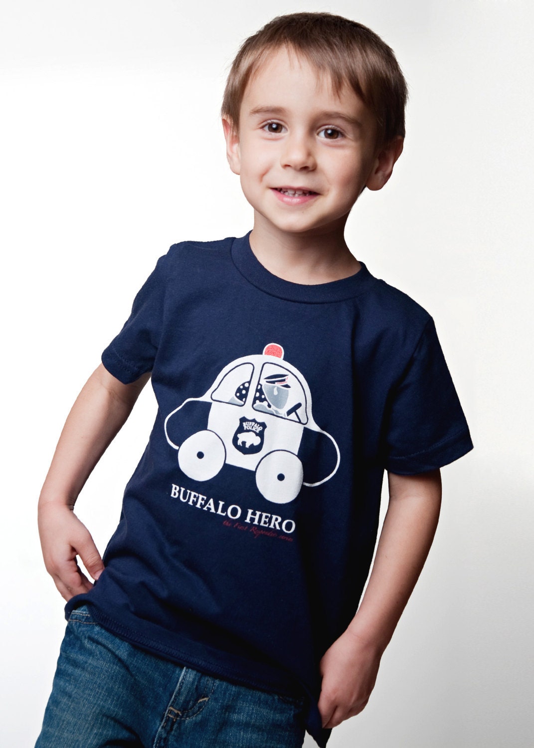
T-shirt designer, artist, Graphic designer, wife and home school mom of 3 boys

What do you create? Buffalo themed art and tshirts for everyone in the family but specializing in infant and children designs. How long have you been working on your craft/art? Nearly 3 years

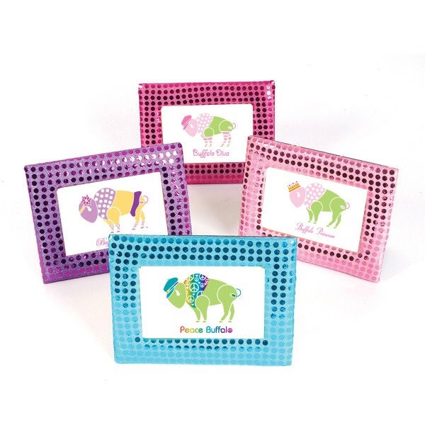
How did you come up with your store name? It was Buffalo Princess based off of of my original design but has progressed to do much more. Standing back and looking at my art, I realize that it's not about princes and princesses but about all those who inspire me. So, I'm the "inspired" buffalo -- Inspired by those around me.


T-Shirt Buffalo, New York Born Unisex
How does Buffalo influence your work? The art that is all around me influences me to WANT to create. The friendly and helpful spirit of the locals make it so easy to network and ask questions. Certainly, the weather is a huge influence, lol! As my one artist friend said, Buffalo winters gives me time to create when I just want to stay inside. :)

What inspires you? So many things inspire me but mostly it's people and the things they do that make them so special. The innocence of babies, the make-believe of toddlers, real-life heroes and more inspire me. My art celebrates their lives

What is the best thing about having an etsy shop?
The best thing about having a shop on etsy, I think, is their search engine ratings. I get a lot of hits from search sites such as google, etc. another great thing I like is the fact that everything is done all in one place. They add the taxes when necessary and the shipping. It was great when I didn't have a way to accept credit cards, I could do it through etsy.

How do you promote your work to the world? Facebook, etsy, email list that people signed up for, giveaways on a local blog (www.fun4kidsinbuffalo.com), and shows.

What is the hardest part about selling online? Getting people to come and see in my opinion.

Where can your work be found locally? Spoiled Rotten in Buffalo, Bay-6 Buffalo Clothing Co in West Seneca, and The Perfect Gift in Clarence Center.

Do you have any up and coming art shows/craft shows that you would like us to know about? I'm going to be at the Erie County Fair August 7-18 from 9am-11pm in the Event Center. Would love for you to say hi and introduce yourselves!

Do you have any advise or suggestions for new sellers to etsy? Great photos! Renewing. Get people to come to it.


Do you do this full or part time?
 I just know I work a ton while juggling the rest, lol!

Have you had any formal training in what you do? My business has been "baptism by fire" as they say. Formal training was my graphic design. Graduated nearly 20 years ago from UB.

Where can you be found online? (website,facebook fanpage, etsy link, blog, flickr) on Facebook: inspired buffalo; on etsy: www.inspiredbuffalo.etsy.com; email: mak@inspired-buffalo.com


 Thanks Marinette  for sharing your experience with us! If you are from Buffalo and would like to be featured on the blog please contact me for more information!!

Saturday, July 27, 2013

ART SHOWS 101: Survival Tips for Show Artists and Crafters, Vol. 19: Bigger Isn't Always Better


Understanding the Connection Between Expenses and Net Profit

In an ideal world, participating in "Big" Art Shows should lead to BIG profits -- right? Well -- sometimes yes, and sometimes not so much. Traveling from city to city to participate in festivals can get pretty expensive. There are hotel/lodging expenses, gas, tolls, wear and tear on your vehicle and increased food/dining expenses - not to mention TIME! Your time, that you could spend doing something other than driving or hanging out at a hotel after the show closes for the day.

Be sure to consider ALL of the costs of doing shows before diving in. It's amazing how many artists just don't do that! Bigger does not always mean better!

Let me offer a case in point:

 I decided to opt out of a Central New York show that I usually do on this weekend. It's a three day street show that has seen it's attendance decline over the years. Instead, I participated in a one day show in Ithaca - the Ithaca Artists Market -- and it turned out to be a good decision! While I sold less art work this show, my expenses were lower, so I  actually made more money than I did at last year's much larger three day festival. 

Now, it doesn't always work out this way :-) But taking a close look at the actual costs connected to shows can help you decide which ones are must-dos and which ones you may want to skip next time around. 

Here are more pictures from the show:


Until next time - keep creating!


Alison

https://www.facebook.com/ArtistAlisonEKurek


Friday, July 26, 2013

10 Tips for Running a Great Garage Sale

 Several weeks ago my friend and I had our annual garage sale.  It is a bit of work but we always have fun doing it. Below are ten tips that will make for a successful garage sale. 

1. Visible and Clear Signs:

No one can come to your garage sale if they don't know the address, date and time. Be clear, if it's just one day make sure to write that on the sign. For example "Saturday Only".   Make sure the lettering is bold and neat and able to be seen from a car. I suggest white poster board with large black lettering. 

2.  Flexible Pricing:

Be willing to negotiate.   One thing to ask yourself is if you don't sell a particular item, what will you do with it? If there are items that you feel are valuable make sure to write "FIRM" after the price on the tag.  

3.  Plan for Bad Weather:

The weather can be unpredictable, especially in Western New York.  So was the case the morning of our garage sale. Thankfully we had several tents and also the use of the garage.  Even though it was raining, people still showed up because we had tents. Also having tarps to cover your items is also a good idea and are inexpensive. 

4.  Advertisements:

Placing an Ad in your local/town newspaper.  Many people who are "garage salers"  scout the ads and find them useful when coming up with an itinerary. Follow the same rules as you would with making signs. 

5.  A Clean Yard:

Make sure your yard is free from grass clippings, dog poop or large branches that someone could trip on. 

6.  Put Away Items You Don't Want to Sell:

People always find a way of scouting out those items that are in visible view but are not for sale. Put those items away.  If you are using your garage, use tarps to cover up anything not for sale. This is especially important if you are running a garage sale with multiple people. This way nothing will be accidentally sold. 

7.  Guard Your Money:

Make sure you know where your money is at all times. Also, keep your cell phone with you. Don't give anyone the opportunity to steal from you. 

8.  Plastic Bags and Wrapping Materials:

Have plastic bags and wrapping materials such as newspaper or bubble wrap to package up anything breakable.  Your customers will appreciate it and you won't have to clean up broken bits. 

9.  Take Signs Down:

There is nothing worse than having a bunch of people stop to your sale after you have everything packed up. Although this still can happen, taking down your signs is helpful.  Gas is expensive these days and it is annoying to follow a sign to a garage sale that is no longer running. 

10.   Organize Your Items:

It is often helpful for yourself and your customers to have organized sections such as books, toys, clothing, etc. If someone is looking for a particular item this makes it easier for them to scout it out. It will also makes it easier to pack your left over items at the end of the sale.  


Does anyone else have tips for a successful garage sale? If so, post below. 

Tuesday, July 23, 2013

Accepting July Creative Challenge Entries


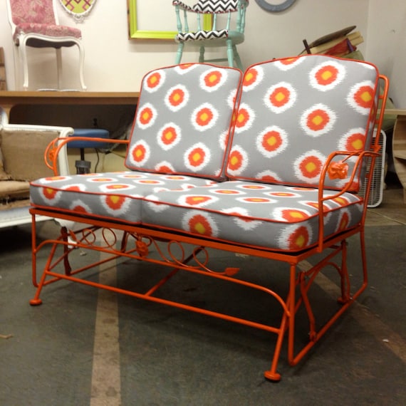
Wouldn't that glider look great sitting beside a sparkling blue swimming pool?

This is the week we accept submissions for our July creative challenge, and this post is where you can do it (late as it is- I apologize!). If you have made something that fits our theme of Swimming Pools and Movie Stars (chosen by June's winner, Jessica from Fast|crawl), here's how you can submit your entry:
  1. Post a picture of your theme-inspired creation/vintage find to a publicly-accessible place online (list it on Etsy, or post to your public Facebook fan page, Flickr, etc.).
  2. Post a link to your entry in the comments below before the end of Saturday, July 27. (The original deadline was Friday, but since I'm late in posting this, I'll extend it another day.)
As always, I look forward to seeing what you've all done. We'll start voting for a winner on Sunday, July 28, so stay tuned and stay cool!

Photo tips 3: Make your own light box!

Today we're making a light box!

A light box is a great help to product photography. It's made to create balanced lighting for product photography. Side-to-side lighting helps to eliminate harsh shadows and give an even appearance to products. Top-down or one-angle lighting will often distort a color from side to side.

You can make a light box for very little money. I had all the items here except the lamps ($8 each at Walmart) and bulbs.


Of course I couldn't find matching lamps!

You will need:
  • One tall box (at least 2 feet)
  • One sheet of white posterboard
  • Two sheets of 11x14 tracing paper
  • The longest ruler or yardstick you own (I used an 18" ruler)
  • X-acto knife
  • Sharpie marker
  • Wide packing or masking tape tape
  • Two adjustable-neck lamps
  • 60-watt GE Reveal lightbulbs
Lots of pictures and step-by-step instructions this way!

Monday, July 22, 2013

Monday Interview with Sempre Vintage!

This week Sempre Vintage joins us! 

Please tell us a bit about yourself?
 I have always been an avid lover of vintage clothing and accessories. I also strongly believe in recycling whenever possible. These two loves have found a great marriage in my business- Sempre Vintage. Wearing and collecting vintage is a great way to make sure wonderful items have a second life and don't go directly into a landfill. My goal is to find interesting and unique, but still very wearable vintage items and find them a good home.

How did you come up with your store name?

“Sempre” is Italian for “always.” The items in my store deserve attention and exude a style and sophistication that will never go out of fashion.

How does Buffalo influence your work?

I opened this business 3 years ago after moving back to Buffalo from Brooklyn. I felt that the Buffalo community needed a chic vintage shopping experience. I love this city and have had a wonderful reception. Sempre Vintage was just voted the Best Women’s Vintage Shop in Buffalo Spree’s Best of Western New York 2013!

What is the best thing about having a etsy shop?

The people I sell to are really wonderful. I have to say that I have had very few negative experiences. I feel that I am selling to knowledgeable collectors of vintage with great style who will truly treasure the pieces in my collection. This makes my business very fulfilling.

Where can your work be found locally?

I have a physical location inside the Webb Trading Company at 1396 Hertel Avenue. Our space offers a unique shopping experience. Complimenting my vintage collection is a carefully selected array of fine antique furniture, decorative arts and home decor. Come visit us!

Where can you be found online?

 https://www.etsy.com/shop/semprevintage
www.semprevintage.com
https://www.facebook.com/semprevintage


 Thanks so much for sharing more about you and your shop with us! If you live in Western New York and would like to be featured on the blog please contact me for more information.
 

Saturday, July 20, 2013

ART SHOWS 101: Survival Tips for Show Artists and Crafters, Vol. 18: Vocabulary Words


ART SHOW VOCABULARY WORDS:

Be-Back: a person who announces "I'll be back" as they walk out of your booth. Once in a while they do come back, but usually not.

Buy/Sell: mass produced art and craft work that is purchased (not made) and resold by an exhibitor. Buy/Sell is banned at most shows. If you're caught with it you'll be shut down.

New Normal/New Good: a recent term used by exhibitors who are accustomed to having good sales at shows and are seeing smaller sales totals.

Paycheck Show: a mid-range income show. Not great, not bad -- similar to getting a paycheck for the number of hours you spend at a show.

Sh*t-On-A-Stick: usually a derogatory term applied to low-end garden art. It can also be used to describe the over all quality of a show - "it was a Crappy Craft show with a lot of sh*t-on-a-stick". But I have to say, I've seen some wonderful garden art on sticks this year :-)


Until next time -- keep creating!

Alison

https://www.facebook.com/ArtistAlisonEKurek

Tuesday, July 16, 2013

Photo tips 2: How to use your camera

Now that you've chosen and purchased your camera, let's talk about using it! I'm going to stick to using your camera for Etsy purposes only here.

Understanding the settings

Most cameras have a standard "portrait" setting which will be adequate for taking pictures. Many also have SLR-like priority settings, like aperture priority and shutter priority, as well as full manual settings.

So what the heck do these words mean, and when should we use the settings?

Aperture: The size of the opening in the lens. The larger the aperture, the more light let into the lens. The f-stop (focal number), however, is reversed: f2.8 is a very open lens, while f22 is a very closed lens. (If you enjoy math and photography, geek out on f-stop info here.) It also has an effect on depth of field, see below.

Shutter speed: How fast the shutter in the lens opens and closes. The faster the shutter speed, the less light let into the lens.

Aperture priority means that you pick the f-stop you want, and the camera adjusts the shutter speed to the lighting. Shutter priority means you pick the shutter speed, and the camera adjusts the aperture to the lighting. These priority settings will pick the appropriate complementary setting to give you a good picture.

The final term you want to be familiar with is depth of field. Depth of field refers to the amount of the shot in focus. If the entire picture is in focus, you have a deep depth of field. If one object is in focus and the rest of the picture is blurred, you have a shallow depth of field. Depth of field is controlled by the aperture of the lens. The more open your lens (f2.8), the shallower the depth of field is.

A shallow depth of field is useful to isolate an object and to draw focus to a specific part of the setting. It also creates a more interesting picture:

Shallow depth of field focuses on the earrings while blurring the bowl.
The boxes, the metal container and the candle are all in focus in this picture, which has a deep depth of field.
You can create a shallow depth of field while on auto-settings by taking a very tightly framed picture: Get very close to the object, and set your focus on one portion. You will see the camera adjust the focus in your viewfinder.

When to use the settings

Aperture priority is used mostly when you want to control the depth of field. An open aperture gives a shallower depth of field. You can use this to great effect for Etsy photos. I would recommend it for detail shots or secondary images to make your listings more interesting.

Shutter priority is best for taking pictures of fast-moving objects, as it will freeze the motion while adjusting the aperture for lighting. Not really useable for Etsy!

This website has a great breakdown of aperture vs. shutter priority: http://digital-photography-school.com/aperture-and-shutter-priority-modes

If you are a complete photography novice, start off with "portrait" or "auto" settings on your camera. It will give you a pretty good picture. Once you're comfortable with that, experiment with priority settings. The great thing about digital photography is you can take as many photos as you need to figure it out!

Thanks for reading! Next week, I'll be building my own lightbox and talking about lighting your items.

— Jocelyn | paragraphloop.etsy.com

Monday, July 15, 2013

Monday Interview with My Retirement Gig!

This week Pat Sadler from myRetirementgig  joins us! 


Please tell us a little bit about yourself?
I’m Pat Sadler and I was born in London a few years after the war; I was raised in Kent, which is located south east of London and houses some historic monuments such as Canterbury Cathedral, and many Oast Houses which were used for drying hops, hence my passion for old English designs and English ale!.
I came to the States in 1979, got married and have called North Tonawanda, New York home ever since.
My wife and I have 2 great adult kids, who are very entrepreneurial. My son owns his own business called Sadler Fence and Straining in North Tonawanda and my daughter is a social media wiz who now lives and works in London.
I have worked in the same industry since 1980 manufacturing PVC fencing, decking and railing products. I am also an avid woodworker with a shed full of machinery and a head full of ideas but a lack of time to put them to work to my advantage. 
 On the wrong side of 50, I decided to start looking ahead to what I want to do when I grow up.
My daughter, who knows of my passion for making and selling my products, suggested that I try Etsy as an outlet. That was in November of 2011. My Etsy site is www.myretirementgig.etsy.com
Etsy is a good site, and it will work for you if you stay on top of it. Once I caught the selling bug I wanted to move more products so that I could invest in machinery and materials and marketing. I wanted to grow!
 I needed another sales fix, so my daughter designed a website for me. www.sadlergardencollections.com a venue for additional exposure.

My first bird house/feeder was build back in 92 and since then I have added a lot more designs.


What do you create? How long have you been working on your craft/art 
I work with 2 very different materials, wood and PVC (rigid vinyl). I make bird house and nesting boxes out of wood. I also have a line of PVC products such as tube feeders, tray feeders, planters, mailbox posts, lawn signs, decorative garden accents and a line of flower boxes that are only sold locally because they are custom made.
I have been designing products for over 30 years, and I am a self taught woodworker.

Where do your ideas come from?
I am always on the lookout for ideas, solutions to a problem or opportunities.
My wife also helps in the business doing all the stenciling work, yes; it is all done by hand.
I love to travel and often find ideas or shapes in foreign places. 
Do you make special request orders?
I will look at every opportunity to grow sales and give customers what they want. I have made special customized products, personalized products, real estate signs, A Woodgrain vinyl mailbox post for Olive Garden. I have also  made special planters for local nurseries. You never know where the next opportunity lies.

 Do you have any upcoming art/craft shows? 
I have signed up and been accepted for 3 shows so far this year
June 30th The Buffalo Garden Art Show will be my first show in 10 years
July 20th 21st Canal Fest of the Tonawanda’s
October 12th, 13th, &14th Letchworth Arts & Crafts show.
That’s it for now. Depending on how these first 3 go I may try for a couple more.
Please come out and say Hi.


Do you have any advice or suggestions for new sellers to Etsy?
I have enjoyed my 2 years on Etsy because it has allowed me to sell products without too much effort. There is a nice feeling when you first start up the computer in the morning and find an order that came in overnight, has been paid for in full, and just needs shipping.
I by no means understand all the intricacies of marketing and promoting my products on Etsy, but my advice would be;
Keep the new products coming; they keep you high on the search lists.
Thank all the treasury creators for including your product and follow them. Follow all the people who favorite an item.
Have impeccable customer service.  I always thank the customer for the order, tell them when I am going to ship it and then after it ships let them know when they can expect it to be delivered. The feedback is very important to me and it lets other potential customers know that you are credible.
Follow up with a convo to see how they like the product now it is in their hands. They may offer some idea to improve it that you hadn’t considered. With such a follow up they may even refer you when a friend or family member is looking for something.
Good luck and good selling!!


Thanks so much Pat for sharing your work with us! If you live in Buffalo and would like to be featured on the blog please contact me for more information! 
Saturday, July 13, 2013

ART SHOWS 101: Survival Tips for Show Artists and Crafters, Vol. 17: Show Hospitality


When it comes right down to it, we do shows to make money. I can't think of one show artist who would choose a low sales show over a high sales shows because the promoter treated them well -- but it certainly is nice when you can combine the best of both worlds.

I'm at the Cain Park Arts Festival in Cleveland Heights this weekend, and I can not say enough good about the hospitality shown by the organizers. They are extremely organized and offer help above and beyond anything I have experienced in the past. I had help unloading my truck, setting up my tent, hanging my weights. They've served us decent coffee and good donuts, a light lunch during set up on Friday. They've checked on us repeatedly throughout the day -- booth sat -- asked "what can I do for you?". In fact, I think I heard the phrase "how can I help you" more yesterday than I have in 20 years of doing shows combined!

Yesterday's sales were okay -- nothing record breaking. But Fridays aren't known to be the best of sales days at many shows. There are still 2 more days to go and I'd better get out of the hotel and headed back to the show. I'll let you know how it goes.


Until next time -- keep creating!

Alison

https://www.facebook.com/ArtistAlisonEKurek

Thursday, July 11, 2013

Everything Old is New Again .....in Shabby Chic Style


As I've discussed in earlier posts, it's important to understand styles and trends. Being aware of terms related to different styles can help you better serve your customers and increase your business.

What is Shabby Chic?

  Shabby Chic is a style of interior design.  The term applies to furniture and furnishings.  It combines new with old.  New items are often distressed to appear old and older items are chosen because they show their age.  It's a great style for those on a limited budget because pieces do not have to match and can be found at flea markets and estate sales.

Themes:

comfortable
warm
softness
cottage
worn
casual
cozy

Here are three pieces from Etsy that fit the Shabby Chic Style:

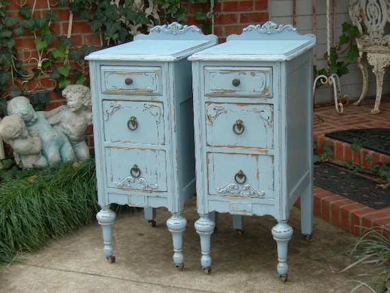
Nightstands from RedBarnEstates

https://www.etsy.com/listing/151900317/custom-nightstands-order-pair-of-shabby?ref=sr_gallery_2&ga_search_query=redbarnestates&ga_view_type=gallery&ga_ship_to=US&ga_search_type=all&ga_facet=redbarnestates


CUSTOM NIGHTSTANDS Order Pair of Shabby Chic  Bedside Tables - Hand Painted Antique Distressed Restored Reclaimed Bedroom Furniture

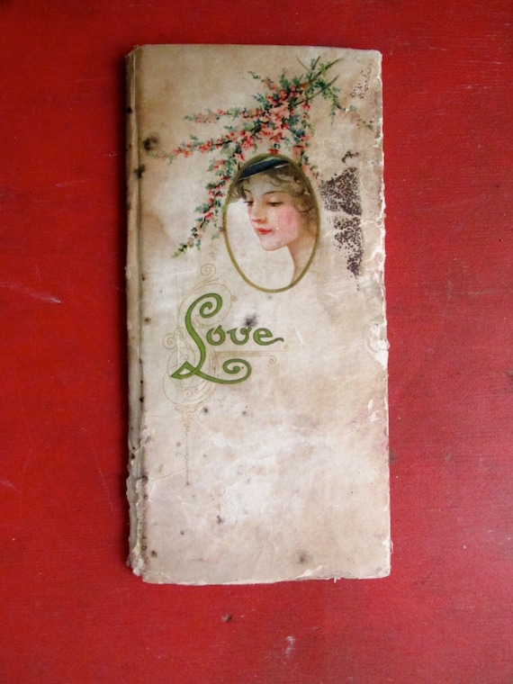
A love poem book from LaceSurplus

https://www.etsy.com/listing/124202293/love-poems-1900s?ref=shop_home_active&ga_search_query=shabby%2Bchic

LOVE Poems 1900's

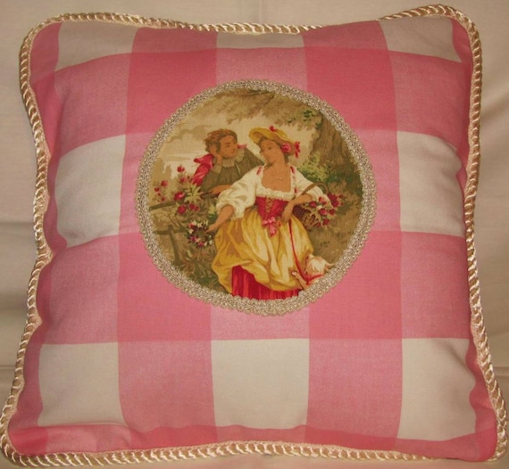
Pillow from TsEclecticTreasures

https://www.etsy.com/listing/130440030/shabby-country-french-chic-cottage?ref=shop_home_active&ga_search_query=shabby%2Bchic

Shabby Country French Chic Cottage Pillow Pink Romantic Fragonard Toile Buffalo Check


Do you have any pieces in your shop that fit this style?  If so, post below!

Tuesday, July 9, 2013

Photo Tips 1: Choosing your camera

One of the biggest myths I hear and read over and over again is that you need a great camera to take a great picture.


Not so!

Composition, lighting and most importantly, skill of the person behind the lens, will all trump less than perfect equipment. I have taken some of my favorite photos with a circa 2002, 2MP Kodak point 'n shoot.

I think a lot of this comes from the increasing availability of "pro-sumer" cameras, and the natural bottoming out of price as technology becomes more affordable. 

I have a Canon Rebel 300D digital SLR that takes great pictures (though, since it is 10-year-old technology, it has been completely outpaced by better DSLRs). So, when I started my Etsy shop, I naturally used my Rebel. It took terrible photos of my earrings! 


My camera!

Currently, I am using a Panasonic Lumix ZS15. It cost around $200 and takes really gorgeous photos. It also doubles as my regular snapshot camera.


The most frustrating part of camera shopping is making a decision. There are so many great camera brands out there that I found it really difficult to narrow it down. Reading online reviews helped, and especially seeing comparison/demo photos. I also like going into stores and checking out how the camera feels in hand, ease of operation, etc. But eventually, you'll just have to pick a brand and go!

Some terms to be familiar with:

DSLR: stands for Digital Single Lens Reflex camera. The simplest explanation is a camera with removable lenses.
Point 'n shoot: Your basic pocket camera. Non-interchangeable lenses.
MP: mega-pixels, or how many pixels per inch (ppi) a camera is capable of taking. Anything over 8MP is excellent.

Zoom: There are two types of zoom, optical and digital. Optical is the physical movement of the lens. The glass in the lens moves, and in non-SLR cameras, your lens will jut out from the camera body. Digital zoom is simply in-camera cropping. You don't get any closer to the subject, and sometimes it even lowers image quality. A camera that brags about high digital zoom isn't really giving you a lot of bang for the buck.
Macro: means extreme close-up, important if you're selling small objects like jewelry.

Step 1: What kind?
The first thing you need to decide is whether you're going to get a DSLR or a point-and-shoot (P&S from here on out).

Buying a DSLR
Pros
• versatile
• extremely high quality photos
• excellent resale value
• easier to have repaired

Cons
• bulky to carry around
• buying multiple lenses can be costly
• expensive
• expensive
• and did I mention expensive?

Buying a P&S
Pros
• inexpensive
• easy to transport
• extended warranties are affordable

Cons
• more breakable
• technology improves quickly, leaving camera with little value after a few years
• difficult to have repaired

Step 2: What brand?


For P&S, I recommend Panasonic or Canon. Canon PowerShots are particularly good quality and have a large range of models for your budget. Panasonic cameras use Leica lenses, which are excellent quality, and typically have high quality macro. No one brand is the best — Nikon and Fuji also make well-reviewed P&S cameras. This is the hardest part, I think, because there are so many "right" choices.


For DSLR, there is Canon and Nikon. They are equally as high quality, used by professionals, and it's really a matter of personal preference.

When I was researching cameras, my priorities were 1. good zoom lens, 2. good macro quality, 3. DSLR-like settings (ability to shoot in aperture priority, shutter priority and manual) and 4. 12MP or higher.

Digital Photography Review is the most thorough website I've ever found for reviews by knowledgeable photographers. It is a bit heavy on the technical terms, but they give great, unbiased looks at thousands of models. If you are not an experienced photographer, check out Amazon for reviews. There are more Average Joes there who post valuable information.

Step 3: How much?


DSLR:
Expect to pay $800 to $1,500 for a camera body and lens. Most DSLRs have kit options that include a basic lens. Zoom lenses run $600-$2,000 and macros (extreme closeups) will be $300-$800.


P&S: You can spend as little as $150 on a really good P&S camera. Expect to spend $250-$350 on a great one.

Step 4: Where to buy?

Once you know what camera you want, it's much easier to shop! The best places to look online are Amazon, B&H Photo Video and Adorama. I purchased most of my camera equipment at B&H, and I can attest to their excellent customer service and lightning fast shipping. Read Amazon's policies very carefully, sometimes their orders are fulfilled through a third party and they may have less-than-forgiving policies.

Check out cameras in person at Best Buy, Target and Walmart. Shop around for price — there tends to be a TON of variation from site to site. I am a fan of extended warranties, as I'm a massive klutz, but that is definitely a personal preference.

Finally

My personal recommendation is that if you are ONLY looking for a camera for Etsy, buy a nice P&S and invest more money in your setup. Only buy a DSLR if you want to learn photography as a general hobby, money to spend, and/or you plan on earning money from your camera.

Helpful links

Camera reviews from DPReview

Thanks for reading! Please feel free to ask any questions in comments. Next week, I'll be talking about how to use your camera's settings for product photography.

— Jocelyn | paragraphloop.etsy.com